Monday, 28 February 2011

27/Feb/2011 Teasmaid

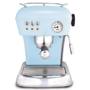
We have a project of designing a teasmaid for the modern world.


I have never heard of such a thing before, on the brief, it says 'the teasmaid is a product of a previous century', then I did a bit of research, I found out that it is a machine that makes tea automatically when the timer reaches the time the user sat. 


I was talking to Lee Tsz Yan about this product, we both agreed it is a bit useless as we can make a tea easily by ourselves and nobody wakes up in the morning and desperately needs a tea anymore, we need to brush our teeth first.


Is that the reason why this product is now disappeared and nobody of my age had never used or even heard about it?


What I'd really like to talk about, is that if designers can make an old concept come alive again.


I searched in my head for some examples. Now because I don't have very good knowledge about the history of design, I only have a few answers, the Mini Cooper, the Fiat 500, the Volkswagen Beetle. Weirdly they are all cars, and that makes it very different from the case of the teasmaid, because teasmaid has been proved to be functionally useless whereas people can't really live without cars since the Model T was introduced. What the designers have done to those cars, are that they have modernised them, to fit them into today's standard while kept the essences of their classic design elements. 


Can a designer make the teasmaid popular again by giving it better functions? Why coffee machines are so popular? I think that professional coffee makers make much better coffees, but professional tea makers make the tea to be no different from teas made by ourselves, however there are some obvious drawbacks about the teasmaid. First it doesn't add sugar or milk automatically, which means you still need to spend time adding milk and sugar. Second, you need to clean it everyday. Last, it makes noise when it is working. What we find here, are exactly the drawbacks a coffee machine has. It's not because of tea is a less popular drink either, because English people keep drinking teas. Now I am in a massive confusion. Why I want a coffee machine but not a teasmaid? I drink as much tea as coffee.


I am going to find it out by doing this project, hopefully.


Sunday, 27 February 2011

26/Feb/2011 Random thoughts

Haven't really thought about a topic for today yet, maybe just talk about something random?

In a few months, I will finish the second year of my university study, which is quite sad because I will probably be going on a placement year, or if not, I will be going on third year. Either ways, I won't be able to see most of the people I am seeing now and my life will get much busier, I think my life is already very busy now. 

In fact, we don't spend much time in class, which I think is so different from China. I was never a university student in China, nor have I finished my high school over there. I only have a rough idea about how university life is in China since I have friends over there and also I spent a few months living in a university studying an English course some years ago. 

In China, we spend a lot of hours in classes, but now I can't remember almost anything happened in those hours. What I do remember, is everything happened outside the class. What I mean is that I didn't learn anything from classes. Maybe I was one of the stupid students who had no understanding of knowledge, but what I could work out was that maybe only 5 out of a class of 60 were not stupid students. To anybody in the world, that's not good efficiency. 

So I am glad that I am now studying in the UK, especially for studying a product design course. We do a lot of practical things here, teachers throw us a project, we gonna to work it out ourselves, step by step, from which I have really learned a lot and enjoyed most of the time. 

When I was comparing my work now to what I have done when I was in foundation course, the difference is huge. I can't believe such change can happen on me. I certainly feel that I can produce work in a much more professional manner now than before, even though I am aware that my work is still not professional enough to be real professional. I feel happy about the fact I have actually learned so much during the time I spent in university. 

For this reason I will continue to work hard, maybe even harder, and find a placement in or near Nottingham because I like here. 

One thing though, I don't feel confident when it comes to materials, I know I am supposed to know more about them, but without systematic class I found it hard to actually work on it myself. Self-study is a hard thing for me.


Saturday, 26 February 2011

25/Feb/2011 Navigo Card

Today I want to talk about card, purely the design of the card itself, not the graphic design but from a product design aspect. 


If the transport department of a city asked a designer to design something that could be used to pay fares for buses and undergrounds in the city, what would the designer come up with?


In the great city of London, there is the famous Oyster Card, I bet that most Londoners have one, and many people who don't live in London also may have it, for example, I got one and I love it. The concept of the Oyster Card is brilliant. 


It is a very simple design, it's basically a card, exactly the size of a normal credit card so it could be easily kept in anywhere, e.g. a wallet. It's a contactless smart card and when people use it to pay for buses or undergrounds, they only need to hold the card near a sensor, of course they also need to top it up when there is no  money in the account.


The story in Paris is very different. They have a thing called carte nominative transport, or what I heard people call it Navigo. It is also contactless smart card and the way to use it pay for buses and undergrounds is still the same, but apparently that designer thought for this design they need two separate cards, then they have to have a plastic case to keep them together. Now I am going to try describing them. 


First of all, there are three parts. A plastic case contains a paper card that wraps around a plastic card. I think the plastic card is the contactless card, there is also a chip on the back side of it so it looks like a chip-and-pin card from behind. The chip might be there for topping up. 


The paper card is twice as big as the plastic one because the paper one wraps around the plastic one. On the front, there are symbols of Paris' transport operators, a space for an ID photo, a box for the card holder to write a name, a serial number, a little window so when it's wrapped around the plastic card, the serial number on the plastic card will be seen, which will match the number on the paper card(the description is so complicated...). On the back there is something looks like terms and conditions.


Then everything are supposed to be inserted into a transparent plastic case.


While the Oyster Card is only about 0.7mm in thickness, the Navigo has a thickness of a whopping 4mm. Which is clearly way too thick for a normal wallet. Then there is a big waste of materials, and it costs more during transportation, most important of all, the plastic case and the paper card seems to be completely unnecessary. Of course one could argue that the paper card is there for the ID photo and the plastic case is to protect the whole thing, but many people don't need an ID photo and a name on their Oyster Cards and I see no problem at all with that. Even if they do need ID photos and names on the student Oyster Cards, they are printed on the cards, so still only the plastic cards are needed. 


Why do French want this kind of over complicated and unnecessary design? I thought about the cultural differences between Britain and France. Yes I am neither a Brit nor a French and I don't know too much about these two countries, at least compare to the natives. What I do know is that Brits drink lager and bitter while French drink champagne and wine, Brits eat deep fried fish and chips while French eat fine dining. Britain has cheap and cheerful Cath Kidston and in France, everybody needs to carry Chanel and Louis Vuitton. Maybe there is a natural flamboyancy in the French culture, everything needs to be delicate and attention to detail, they spend long time to do everything in France. But in Hong Kong, where people also drink champagne and carry expensive bags, they have a card which has exactly the same design as the Oyster Card, with the name of another seafood. Everywhere else in the world, all cards are designed to be cards, not something to be protected in a plastic case. 


I really think the Navigo is over-designed, and the results are really not that brilliant. Ludwig Mies van der Rohe once said less is more, and Dieter Rams once said less but better, they were all master designers. Look at products that are popular today, most of them very simple designs.


Friday, 25 February 2011

24/Feb/2011 Motorola Razr V3

Mobile phones go out of fashion unbelievably quickly. Apart from many models from Sony Ericsson, I think the Motorola Razr V3 is one of the phones that still look nice after many years of its release. I have never owned one of these but I always liked the design of it.


At its time, it was the thinnest clamshell handset in the market with the thickness of only 13mm when the screen is closed. Its body is aluminum and the good thing about it is that the use of metal materials gives a mobile phone an impression of high quality. On the front, the camera lens, external display, the Motorola logo and a gap for the loudspeaker are neatly arranged in a straight line. One thing I found a bit disappointing is that the black frame of the external display is too wide, it would be extremely ugly if the phone is in a brighter colour such as silver. The length of the maid display doesn't cover the entire keypad, a very nice touch is they made the border of the display and the bottom part an arc, to balance the straightness of the arrangement of other elements on the front. Looking from the front, the chromed volume buttons, camera button and another button can also be seen on both sides of the screen.


Flip open the phone, there sits the 2.2 inch screen with an average display quality. The real special bit is the keypad. It's called an electroluminescent keypad, it is a single piece of metal with all the numbers and symbols on the keys cut by laser. It's looks very high tech and innovative at the time, but when I actually used the keypad, it gave me a very fragile feeling, I think the main problem was due to the thin body. The keypad also felt a lack of feedback compare to traditional buttons. However I think it is acceptable considering its aesthetic value. The electroluminescent thing made the keypad really clear, easy to read and beautiful in dark environments.


Since I haven't actually owned one of the Razr V3s, I can only describe it by looking at pictures on google but can't really talk about the whole design in details. To conclude, what I like about this phone are the material choice, rather unusual keypad and its neatness. A few details are not perfect but it is still a good design to me after all.

Thursday, 24 February 2011

23/Feb/2011 Innovations

If designers apply their innovative thoughts towards different directions, the difference between results could be dramatic. 

Both Alessi and Dyson are companies that famous for applying innovative designs to their products. While they produce products for completely different purposes, I found they are actually quite similar in terms of innovative design. 


Alessi's products are all everyday, they used innovation to improve the aesthetic values of their products. Kettles, corkscrews, timers, they are all very ordinary things. They do their jobs proper and nobody expected them to be beautiful. What Alessi have done, was to gave these ordinary things hearts and souls. Alessi brought them to life. Mind you, products cost a tenth of Alessi's could do the same job and produce the same results, the performances are not improved in anyway.


On the other hand, Dyson are more of an inventor. Over the years their innovations made the performances of their products far beyond others'. Compare to Alessi, Dyson's innovations helped more on the technological values, which made their products unique. 


With a bit more research, I can write way more than this on this topic. The problem is that I am really sleepy now, I might continue this another day. Got class at 9 in the morning. 

Tuesday, 22 February 2011

22/Feb/2011 Function-Follows-Form

I have a calender on my wall, I got it when I bought an issue of the Top Gear magazine. So in the calendar, every month has got a few pictures of a car. 


Yesterday, I turned the page to February, and before that it was January. It has been three weeks since February arrived, and very often I look at my calendar. How could I forgot to turn the page?


The reason is simple, on the page of January, it's got pictures of a Ferrari 458 Italia, it's a beauty. I always remembered that there are some pictures of a Ferrari 458 Italia in my room, but I have almost forgot that it actually is a calender. 


So that got me wondering, do people ignore the real function of a product if it is very beautiful? 


They do.


I was reading a book this afternoon, on one of the pages there was the Philippe Starck's lemon squeezer, the Juicy Salif. I have never used this product in real life, however on the book it says it's 'more of an iconographic style statement than a functional object', which means it's a bit useless for squeezing a lemon. Nevertheless this is one of Philippe Starck's most famous products and one of the best-selling Alessi products. Apparently people don't really buy it as a lemon squeezer because it's very easy to squeeze a lemon by hand. They buy it because it makes their homes look stylish. Look at it, it's like a component from a UFO!


Now I realise I am talking about function-follows-form products. 


Many other Philippe Starck's designs follow the same route, especially his watches. When I was in India, one of my mates bought a Philippe Starck watch, I liked that watch but it took me half a day to figure out how you read the time on it; and for two weeks, Leslie has been moaning about he can't read his new stylish Philippe Starck watch in class.


One thing they do very well in common, is to bring beauty and fun into our lives. The Juicy Salif works as a mini sculpture, and the watches are there to show ways of innovative thinking. If I had a Juicy Salif, I wake up in the morning and see it in my kitchen, I would be happy. Like I said, the function of function-follows-form designs, is to put smiles on people's faces.


I don't know what the conclusion of this article is. Function-follows-form designs are not as useless as it sounds? Or aesthetic is far more valuable than practicality?


One thing I know, is that my calender might stay in February a bit longer, because it's got the Koenigsegg Agera in February's page.


21/Feb/2011 A mint package


I bought this box of mints in Costa, when I was having it in the classroom, two of my classmates noticed that I was eating mints and more importantly, both of them mentioned that the box is a very good piece of design.


What is so special about this little tin box?
First, I am not going to talk about what they said was good about this box at the moment. Many people buy mints, and I bet a million quid, that even it’s something so unobtrusive, people will prefer to buy mints with nicer packages, because all mints taste the same and people always like better looking things. POLOs are nice but the package is just so perfunctory, and that’s why I stopped buying them. If there is something I need to take it out of my pocket time to time, I need it to be delicate, a little metal box will do the job. 
I’d like to say this box looks appealing to me. It’s silver with its name written on the top of the box in grey, again a minimalism visual effect. It’s rectangularly shaped with rounded edges, that makes it fits better in pockets, especially for people who like to wear skinny jeans, which according to Jeremy Clarkson, is one of the two coolest things in the world. The back of the box has a sticker with some information nobody cares about. Such as ingredients, nutritional values and weight. The box is thicker in the centre than the edge, it looks bulky, feels like they filled more mints in the box than it can contain.  


Already, so many details went into designing a little peppermint box.


Open the box, you can see the reason why my classmates mentioned it was a good design. Under the metal cover, there is another black, plastic unremovable cover with a little hole on it, so whenever you want some mints and you shake the box, it only allows one or two of them to come out each time. Also the hole is placed at the bottom left corner of the rectangular shape, so it's easy to pour the mints on hand. Consider the surrounding environment when people want a mint. It could be on the street while walking, could be standing on a bus, or underground. Without this plastic cover, mints could be spread all over the floor if the person using it had a big wobble. This is an example of a little detail that improves the whole design.


Ignore the rounded edges, ignore the colour choice, ignore the bulky effect. This little black plastic unremovable is the essence of the design of this box. As Dieter Rams said, good design needs to be unobtrusive. This box design ticks the box for that. 


Sunday, 20 February 2011

20/Feb/2011 Form and Function

I came up with a theory while I was thinking about what to talk about today. That form-follows-function designs are generally more masculine and function-follows-form designs are generally more feminine. 


The first object came up in my mind is the original, military spec Humvee, it is an obvious example. Everything made for military uses doesn't need to consider it's aesthetic aspects at all. Every detail on this vehicle is there for the practicality. The doors open 180 degrees for easy access to the cabin and to do so, they need to leave the hinges to be seen. The tall chassis allows it to be driven cross complicated environment with ease. The armors protect its passengers from bullets, etc. When they were designing this vehicle they thought so much about how well it would perform in the battlefield and they completely forgot about all the bolts and hinges, so they are all exposed. I don't think anybody would describe it as beautiful but doesn't it look like a big, strong man?


On the other end of the scale there sits the first Macbook Air, I use the first Macbook Air instead of the new one as my example is because I really think the new one is one of the ugliest designs from Apple and it looks like a door stop. To make it as thin and light as possible, Apple have compromised a lot. They got rid of many things a decent computer needs. Disc drive? It exists only in your dream. On the entire body there is just a power port and one USB port, which means if you want use a mouse and a import some photos from your camera at the same time, you'd have to buy an ugly USB hub. So you would think it's rubbish, but wait until you see it. Boy it's such a beautiful piece of design. The soft and feminine lines and curves made it elegant and pretty. While it's lack of practical function, it's got another function of putting smiles on people's faces. 


Another unusual computer on the market, the Panasonic Toughbook CF series, has a very different design philosophy. When the screen is closed it looks like it's the suitcase that contains the Desert Eagle. I have seen the Hangover, I noticed that there was a Toughbook CF series in the stolen police car, I know many construction companies use it on the construction sites, they also have them on the British ambulances when I was watching Emergency Services. Because it is water proof, shock proof and dust proof, to say it in another way, you can use this computer in almost any environment. Its body is extremely thick so all the fragile computer components can be wrapped in shock absorbing materials, all the ports around the computer have rubber covers to protect it from water, the display might not be able to display the best quality you can get from laptops, but it can stand a free drop from 90cm height with the machine running. Again this is a form-follows-function design and again, it looks so masculine. Look at the front of it, it's so powerful. 


There are so many examples I can talk about, I found this quite interesting. I am not saying that because of function-follows-form designs are not functionally perfect, so they are not good. In life, what can be better when they give you a good mood?

19/Feb/2011 Some moaning

It's been almost a week since I started my blog, I enjoyed writing the articles and expressing my thoughts, but it is really hard to think about what to talk about in the next article. 

One reason is because I don't have the confidence. At this stage I can't just point at something and then talk 10 minutes about the design aspect of it, I simply don't have the knowledge. Before I can talk about something, I need to do research, lots of it some times. I am a little bit behind many of my classmates on design knowledge at the moment, I am learning and learning is a really slow precess. Then there is my problem on English, I found it hard to describe things accurately in English, especially when I need to describe an object. 

Plus, I have so much work to do lately, can't believe how busy it is in second year I really had not expect this before the start of the year. 

However I still like my idea about having this blog and I am really passionate about it, I am not going to give up and hopefully in the future more people will come and read my blog and will find my opinions helpful, but at the end of the day, I write this blog for myself to learn about design. 


Saturday, 19 February 2011

18/Feb/2011 Destination Control System

All students of the Nottingham Trent University might have noticed that the elevators in the Newton building are a bit different from ordinary elevators. When I used it for the first time I was totally confused, I walked into the elevator and found no button to select floors and then I looked like an idiot.


Now I have been going to lectures there for almost half a year and I can use the elevators with no difficulty.


So I am now trying to describe how they work.


There are only three buttons in the cars, open the door, close the door and call for emergency, that is because all the buttons with numbers on them to choose the floors are outside the cars, just next to the doors. Before you enter the elevator, you select the floor you want to go to, then the screen over the buttons will tell you which car you need to wait for. I have never seen anything like this in my life! Before I started using my brain to think about the reason, I thought it was a stupid idea because instead of having one set of buttons inside the car, they now need a set of buttons for everyone single floor and that sounds like a big waste. 


Then I saw the clever bit, because you need to tell the computer which floor you want to go first, the computer can tell everybody that's going to the same floor to wait in front of the same car, it improvs the efficiency. It avoids the circumstance when one car has stop at every single floor. 


The disadvantage is also obvious, if you decided to change your idea and go to another floor while in the car, you will not be able to do anything. That's fine if it's been used in a university, because you always know which lecture room you are going to. However there might be problems if this system is applied in places like a shopping centre. 


I didn't know what this kind of elevator is called until I read about it on Wikipedia, it is called destination control system, developed by Schindler. Some elevator companies say that this system can improve efficiency by 30%.


I don't know anything about elevator design and I am not going to act like I am an expert, but this system is really clever. 


According to Wikipedia, the first electric elevator was built in 1880 by Siemens and elevator was invented long before that. The destination control system was introduced in 1992, so it's been over a hundred years of its invention that someone had came up with an idea to improve itees efficiency. What I can lear from this is really very simple, to think out side of the box and in this case, it's really outside of the box. As design students we are always encouraged to do so, but it is so difficult to achieve. We are too used to everything we know, everything we use and everything we learned. 


So I could imagine time goes back around 20 years, in Switzerland, an elevator designer was sitting on his table and went 'right, I am fed up with elevators have to stop at every single floor, let's make something new'


Friday, 18 February 2011

17/Feb/2011 The Arco Lamp


It is my all time favorite piece of design, it is a master piece, it is legendary. I can’t remember how I came to know it for the first time, but whenever I ask myself what my favorite design is, I always think about it. It is the Arco Lamp by Achille and Pier Giacomo Castiglioni brothers.


It was designed in 1962 by the Castiglionis and then manufactured by Flos at the peak of Italian design movement’s influence. It is one of the most popular and most copied floor lamps in history.


Its heavy base is made with white Carrara marble, joined by a stainless-steel arch made up with four pieces of curved tubing and fitted together telescopically, which allow the lamp reaches 215 to 220 centimetres into the space. The highest point of the arch is 232 centimetres. The light source is situated in a rounded and polished aluminum reflector and its height can be adjusted between 145 and 175 centimetres. The top of the reflector is pierced by a number of holes which allow the light to emanate from the top of it as well as the bottom. Meanwhile the heavy marble base acts to keep the lamp balanced, and a hole on it to allow the user move it around easily by putting a stick through it. The entire lamp weights 63.8 kilograms, which I feel is quite remarkable for a lamp.

The Arco lamp was soon becoming a means of fashion. It could be found in many fashionable interiors, whether hovering over a desk, dining table or sofa. It has also been used widely as props or a decorative object in a range of films, such as the original The Italian job. Today, the Arco lamp is still popular and being used as decorative illuminators in many interiors such as hotels , dine dining restaurants or people’s houses etc. It is an iconic design of the 20th century.


Back to the end of the Fifties, Italy has started offering a range of furnishing products which full of practicalities and innovative ideas, and many of them are still popular on the market today. Furniture made in Italy was widely considered of having the characteristics of well made, stylish and functional . Italy has been holding a strong position in the world of furniture and interior design. The Sixties was a rapid period of the electrical appliances growth, Italy became Europe’s top manufacturer of such products, and second in the world after the United States of America. Lighting design offered a great sculptural opportunity for designers since it brought art together with utility. Flos, who manufactured of the Arco lamp, was founded in Merano by Dino Gavina and Sergiu Biliotti in the year of 1962, aimed to be the specialist of modern lighting. Flos was courage to be daring and provocative but uphold the fundamental of design. They manufactured products designed by a range of remarkable designers including Castiglioni brothers, Mark Newson and Philippe Stark. Castiglioni brothers’ Arco lamp was one of the very first products in the company’s history. Today Flos has successfully became a leading company of lighting and they are often recognised as the “Rolls Royce” in lighting.

Many of the Flos’ products arose as solutions to exposition problems, such as the Arco lamp. Inspired by the streetlamp, designed to be able to light up the dining area to replace the traditional celling lamp, without drilling holes on the celling of the precious Italian ancient architectures while the installation process, and easy to be moved around. The Arco lamp can be easily placed next to the dining table, and people can walk under its arch conveniently. Compare to the traditional celling lamps, it also has the advantage on practicality and function. 

However, I think the success of the Arco lamp is not only because of its practicality and function, but also the quality and style. Castiglionis’ choice of materials explains. The use of the traditional material, marble, reflects the heroic past of Italian architecture and art, while the stainless steel gives the a touch of modernism. In my point of view, the Arco represents a sense of continuity between past and present. At the same time it acts as a strong punctuation of Italian modern interiors. Together, the materials made it a perfect match for leather sofas and smoked-glass tables, which, are the main materials of furniture design of its time. On the other hand, the style of the lamp had just followed one major principle, simpleness. Combined two main materials, with no unnecessary elements added but has basic functions of a lamp, to illuminate and adjustable. Castiglionis made it pure, hence the Arco can be fitted into any environment and space, and it will never be out of date. In case of interior design, it could be a highlight in a colourful, vigorous living area or into a part of a series of plan dining room. They used the minimal amount of materials while creating maximum effect.

The Arco lamp marks the peak of Castiglionis’ careers. It is a classic piece of work in the lighting design history. After its release, a lot of designs followed the Arco lamp’s concept or inspired by it. In its 49 years of history so far, it shows a level of confidence, stylishness and life quality.

Tomorrow's topic: 

Thursday, 17 February 2011

16/Feb/2011 Kennedy craft knife

So much work to do...


Really tired and the worst thing is I am a bit stuck on the new project.


Anyway, I can’t help if I don’t have any idea in my mind. Maybe a bit of blogging will help.


Today’s topic is about a craft knife. I bought this medium duty knife in the Bonington shop for £3.50, not that expensive. It’s made by Kennedy Tools, which is a tool maker and industrial distribution group based in Leicester since the 70’s.


To design a knife must be a big challenge, one wrong decision could lead to potential danger to the users. This knife makes me feel solid and safe when I hold it in my hand, thanks to its big and heavy metal body (I think it’s a shame that I can only say metal but don’t have the ability to recognise what specific type of metal it is). Those curves and soft edges provide good level of comfort for the hand. The bit that slides the blade out- I don’t know how to call it, I shall call it a slider- is also made from metal, press it with thumb, it unlocks, then push or pull it to control the length of the blade. There are four positions the blade can be locked on and even at its longest position, the blade only comes out for about 2.7 cm, reduces the risk of bending the blade. One problem about the outside is that the two ends are pretty much identical so I often hold it with the wrong end up. If I still manage to slide the blade out when I hold it the wrong way up, the blade will cut my finger.


When I hold the knife in my hand and shake it, I can feel there is a piece of metal inside the knife and always wondered what it could be. I disassembled it by removing that big screw on the body, then I knew it was separate blades. Even though it says there are spare blades provided, there is no explanation or instruction about how you find them and replace them. A bad mark for that. However the change of blades is very easy and straight forward. I can also see how the slider works when it’s disassembled. Now people might think it’s not a good idea to put the spear blades inside the knife and ever time they are needed you have to unscrew it and take all components apart, but I think the designer did this for a reason. First of all, a missing blade is not only a matter of having to spend extra money on buying a new one, but it could be dangerous. The best way to prevent a missing blade, is to put the spare blades inside the knife itself. Secondly, you don’t really need to change the blade that often unless you really use it a lot or cut something hard. Last but not the least, the screw can be easily removed by using a thin coin. So I think the designer has thought very carefully on providing better convenience or safety, and obviously the latter is more important.


I will call it a day now, because I am so tired but still really need to do work for my project. I really can talk a lot more about this knife design, well maybe in the future I will write this topic again to find out if I am improved or not.


Tomorrow’s topic: the Arco Lamp

Tuesday, 15 February 2011

15/Feb/2011 the VAIO Logo


Before I had my MacBook Pro, I always wanted a VAIO, until I had a go on my mate’s mac and found out the Tiger was so much better than Windows. Yes I didn’t want a MacBook Pro for its look, but I wanted a VAIO, largely because I wanted that logo on the top of my computer so badly!

Maybe it sounds stupid if I bought a computer because its logo looks nice, but for some reason, I love that VAIO logo, to me, it’s one of the best logo designs on the world.
VAIO stands for Visual Audio Intelligence Organizer, which is a rather unattractive name and it doesn’t tell you it’s a computer. It is Sony’s computer department, and Sony is one of the companies in the world I admire the most, mostly for their technological innovations and their achievements in the field of portable audio products. 


Some of their models comes with the logo painted on the front, and to be honest, they just look normal. However on most of the more expensive Sony computers, that logo is often a piece of cut metal and mounted on the front of the computer, and that, to me, is a thing of beauty. The computers suddenly feels more expensive and more exclusive with that little metal badge. 


When I was young and had never herd of Wikipedia, I always imagined that the morph of those four letters represents a wave of rhythm and a switch, the little dot in the A acts as an eye and it makes the whole picture a lot more lively. Thanks to Wikipedia and now I know that the VA in this logo represents an analog wave, and IO is a digital binary code. So the VAIO represents a combination of nature and science. 
Still I think it could be read as a wave of rhythm with a switch and a lively eye. Logo designers try very hard to think what their designs represent, I think Sony’s designers did very well on delivering the image they want their products to have. It’s simple, it looks technological, it’s elegant, the metal badges look like they were made with delicacy. Same as the way they marketed their computer products. Sony are not the first name people would talk about when it comes to computing, but over the years they have so many innovations and they have contributed so much to computer design. The first laptop to have a camera on the top of the screen, first laptop with two separate graphic cards, first laptop screen with LED backlight, first laptop to have carbon-fibre as material, first laptop with a Blu-Ray drive, and although the keyboard  design on the current Apple MacBook Pro looks very Apple, it had first appeared on a VAIO back in the 90’s. 


I think the VAIO logo is a classic sample of a good logo design, while it delivers the information the designers wanted it to have, people can still read it clearly as VAIO. Having a pretty logo might not be a key element when people are considering buying a new computer, but when they are struggling between choices, like Tesco said, every little helps.

Images are from Google.
Tomorrow’s topic: Kennedy standard retractable trimming knife